Talent 101
Talent 101 is a workforce services provider for recruiting, hiring, and management
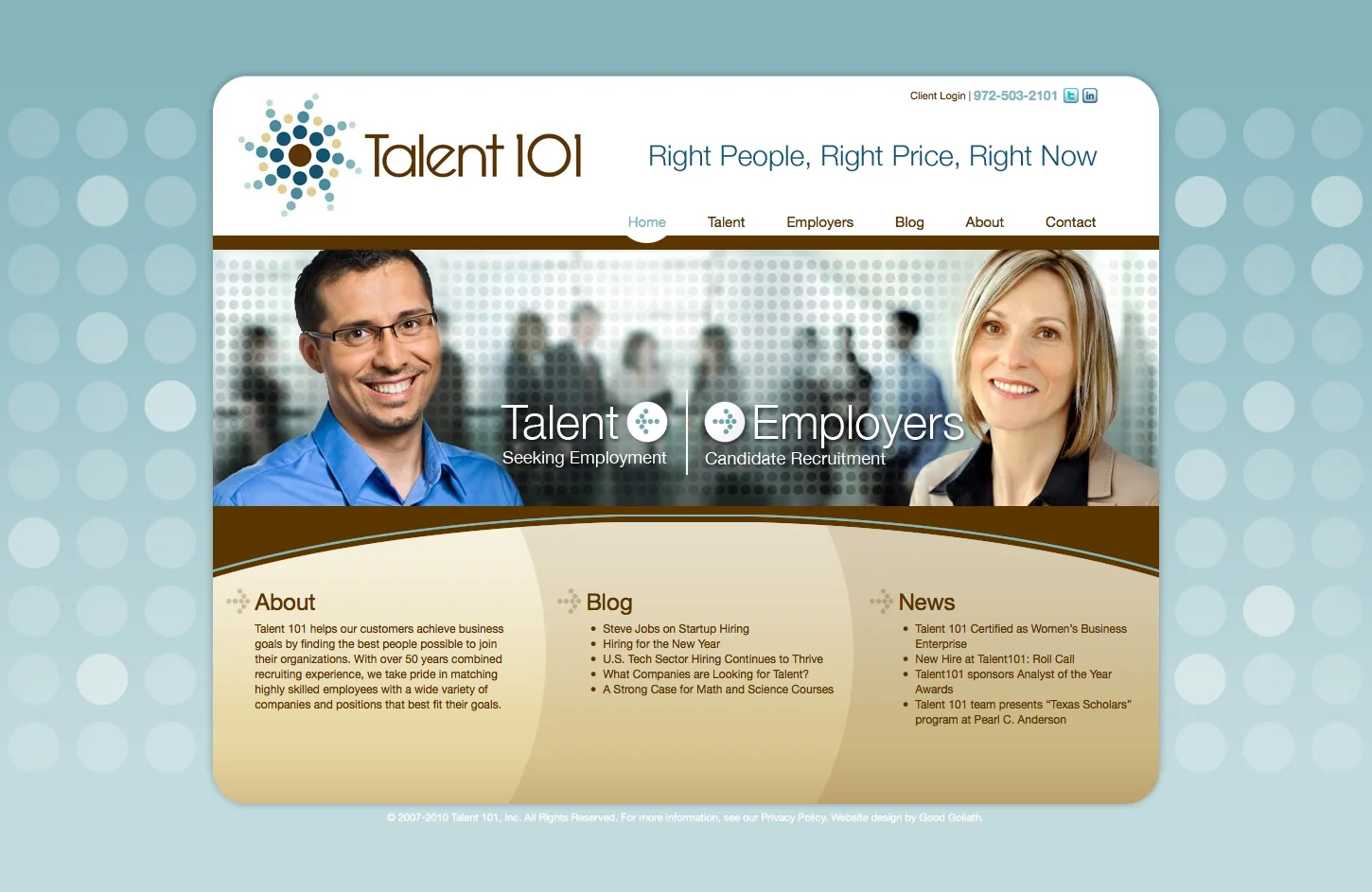
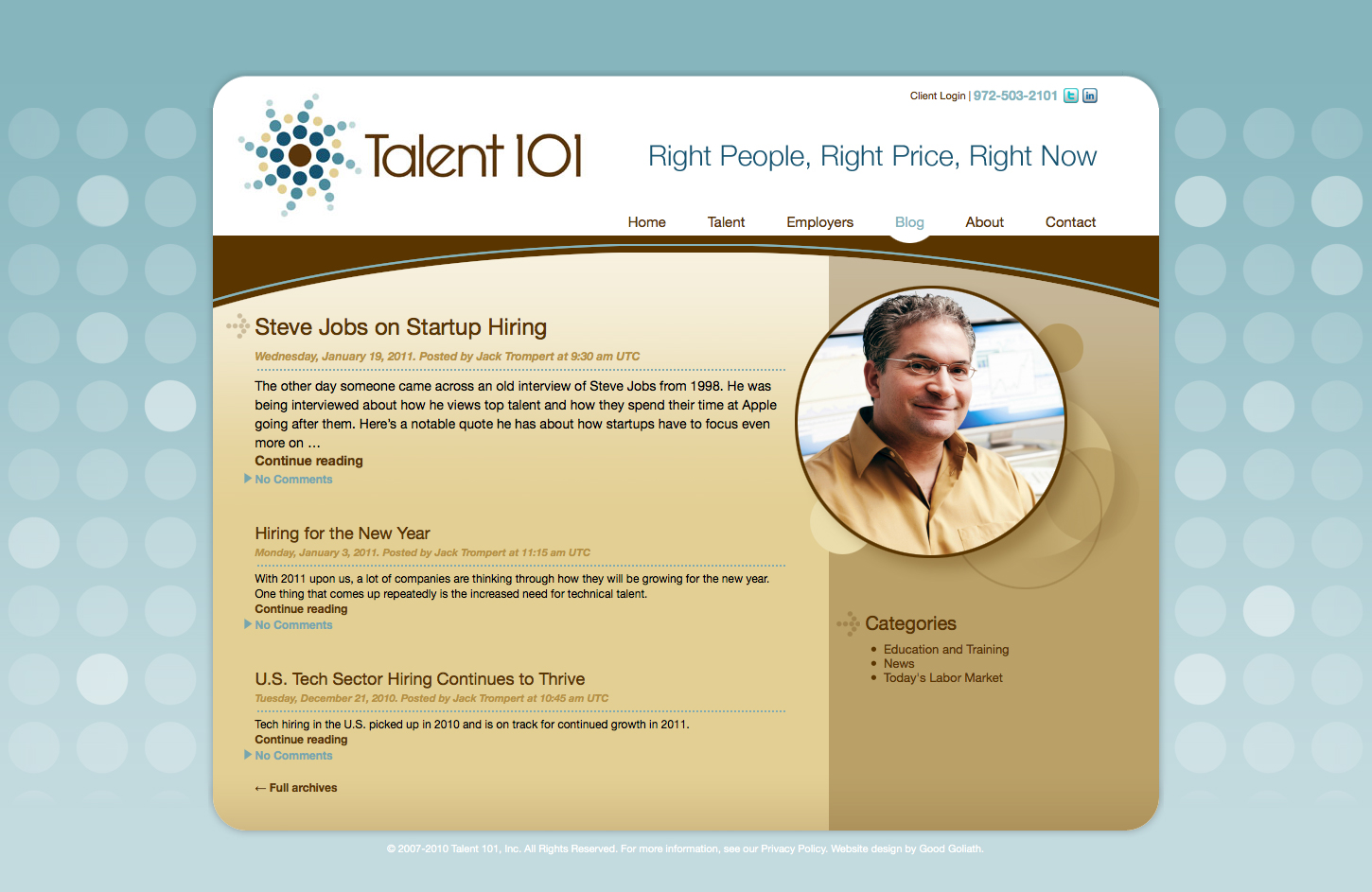
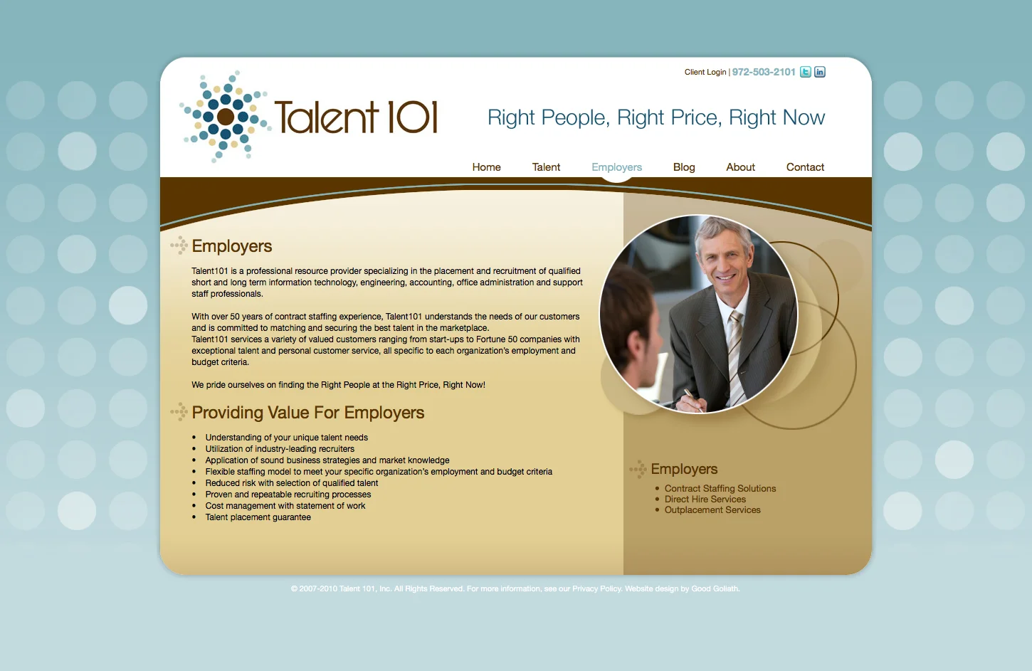
While I was working with Jaxzen Marketing Strategies, one of their new clients, Talent 101, requested a brand update that included a new website design to compete with other professional tech workforce recruiting firms. The client requested a site that incorporated a circular theme with a modern appeal and focused on people in the workforce to emphasize the employer/employee relationship. I presented some design variations and color options. They selected a teal/brown color palette for their logo, so I used shades of those colors as accents to their website. Using the circular theme from their logo, I created a tiled texture for the background. For more cohesive continuity, I incorporated the circular theme within other graphics of the site. The home page banner image contained clickable hot spots, so if the user clicked on the left or right side of the banner, it would fast track the visitor to the appropriate content page of the site.
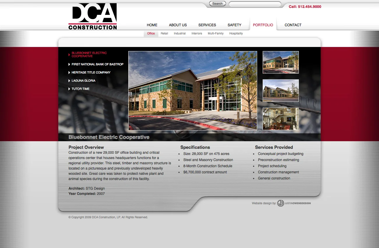
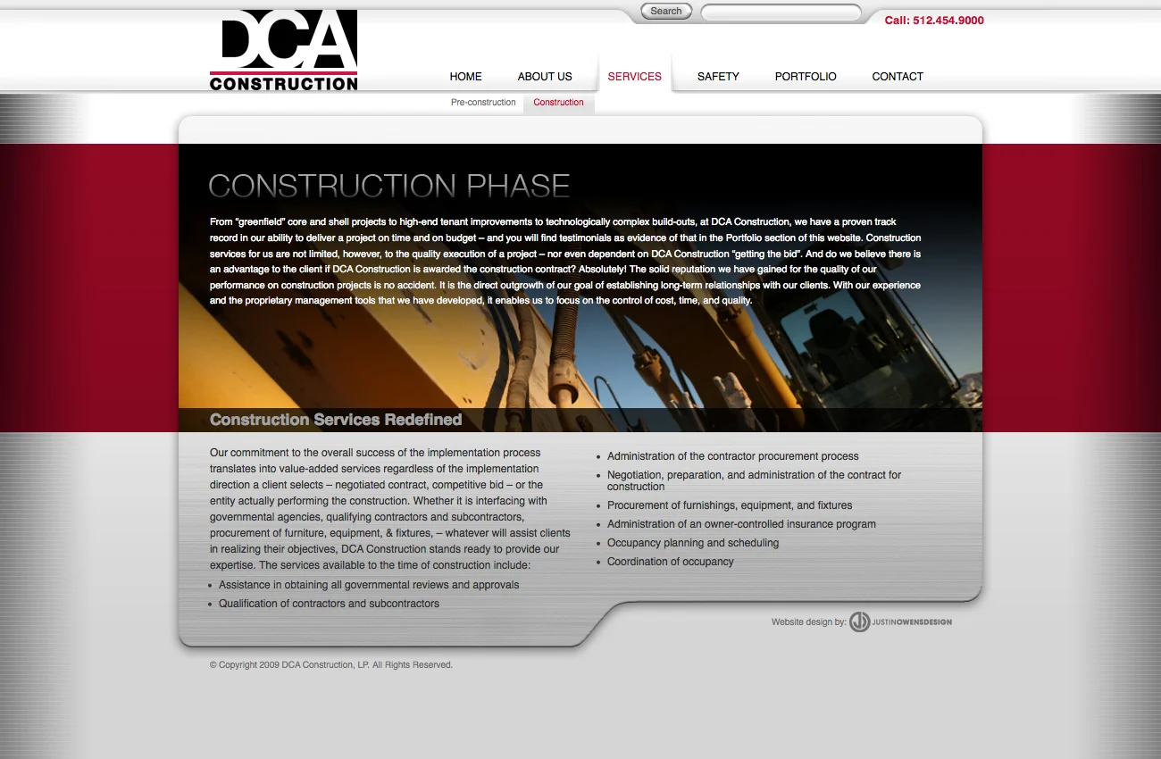
DCA Construction
DCA CONStruction is a general contractor for medical, industrial, redidential, and retail facilities
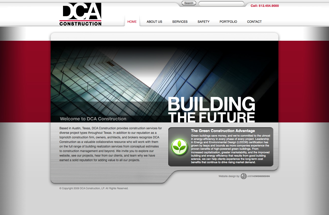
DCA Construction needed an update to their website that was a little more than just a re-skinning. They wanted to be able to upload their own image and text content to their project portfolio pages. I hired a developer to construct a shell format in WordPress that would house the content and give them flexibility with future modifications. Their primary colors were red and black, so I used the red as a scalable background tile to give them a dominant color across their site. The horizontal band housed the primary text and imagery. DCA also requested to integrate a metal plate look to the site. I used a brushed metal texture below the primary content and gave it a tab shape with a drop shadow for more definition. The metal plate served as the supporting text content area. The two-tiered navigation allowed for additional content pages to be be inserted, which was important for the client to make future updates on their own.
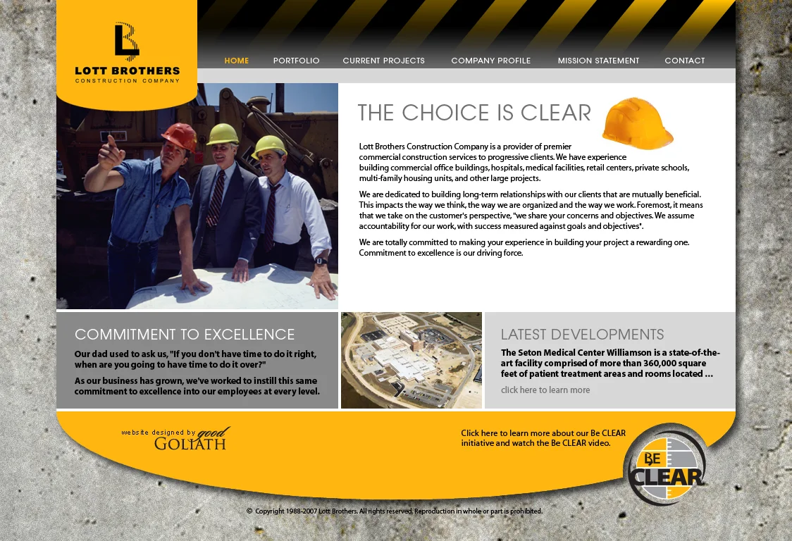
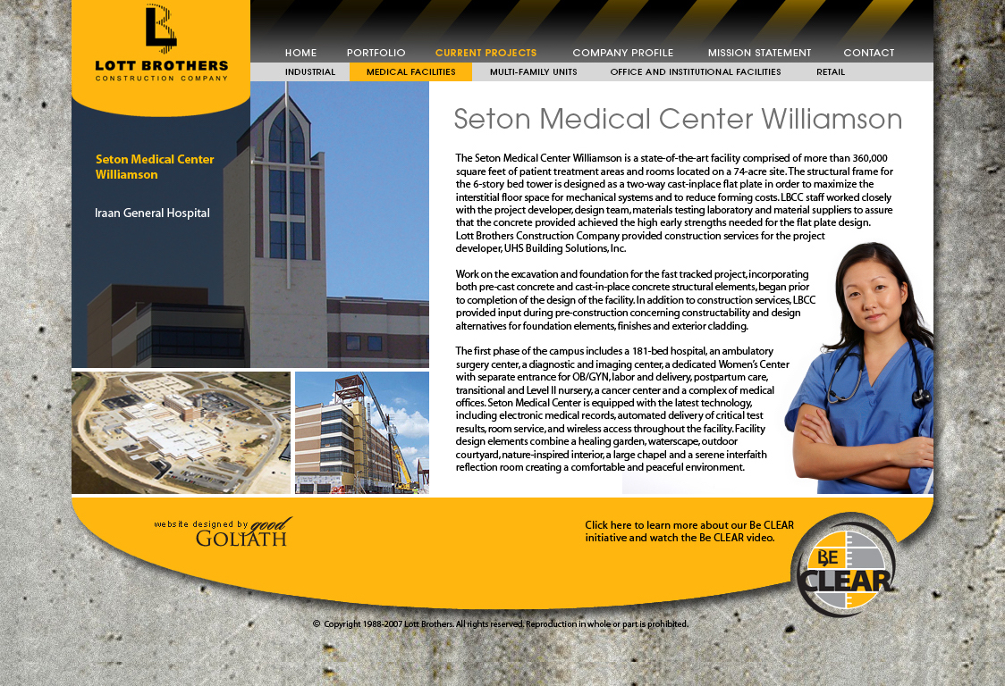
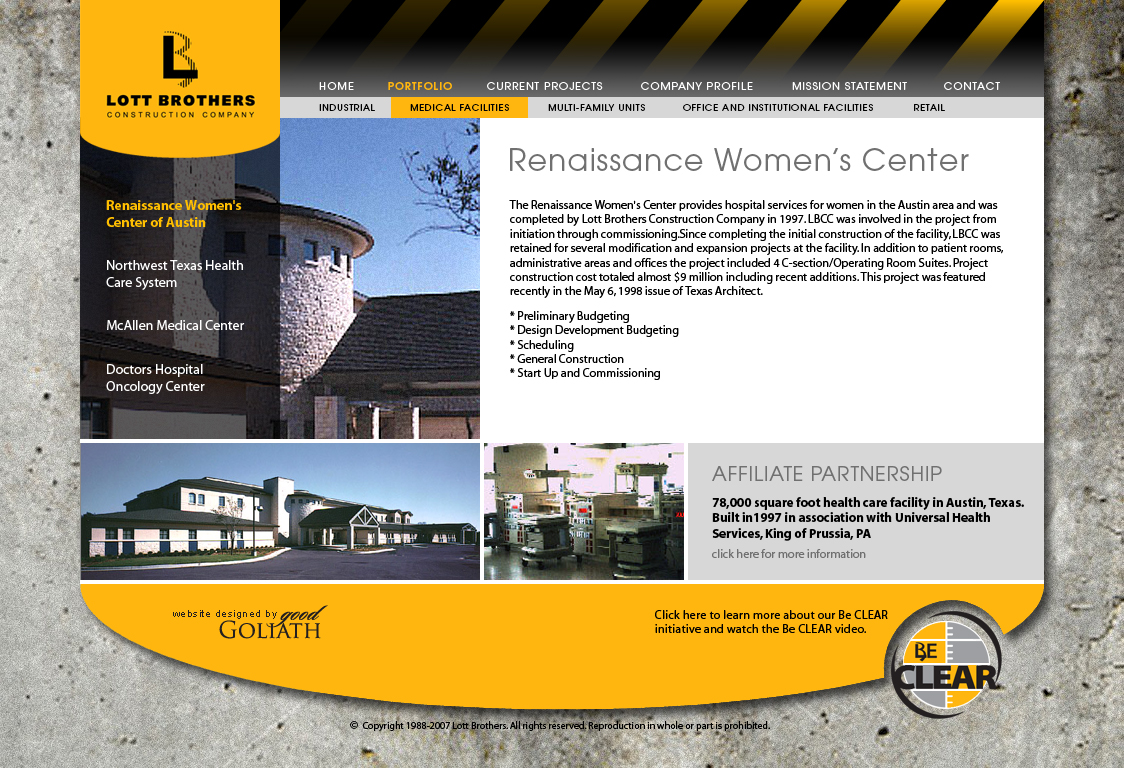
Lott Brothers Construction
Lott Brothers construction is a general contractor specializing in healthcare, industrial, And commercial facility Development
While I was a senior visual designer with the Good Goliath marketing agency, I designed the visual components of the Lott Brothers website. The website framework was developed in WordPress. The client directives were to design framework that could showcase a lot of photography, and incorporate their logo badging and their Be CLEAR logo prominently through the site. They wanted their site to look professional but with a very rugged appeal that the user would know immediately when they were on the landing page that they were a construction company.
I used a tiled concrete as a background visual to give it the rugged look, then on top of the concrete was the more polished look. Because their logo badging was so important to them, I incorporated the rounded bottom shape into the framework of their site. I used the logo badge as a topper for the sidebar drop menu content which displayed a black overlay to allow for better definition of the navigation, while still allowing the photography to be visible beneath it. The three-tiered navigation system allowed for multiple layout framework to support various types of content. The majority of the content consisted of current and previous development projects. The client supplied construction site images of their facilities which were mixed in with some stock imagery for more polish. Some of the page content featured articles and customer quotes.